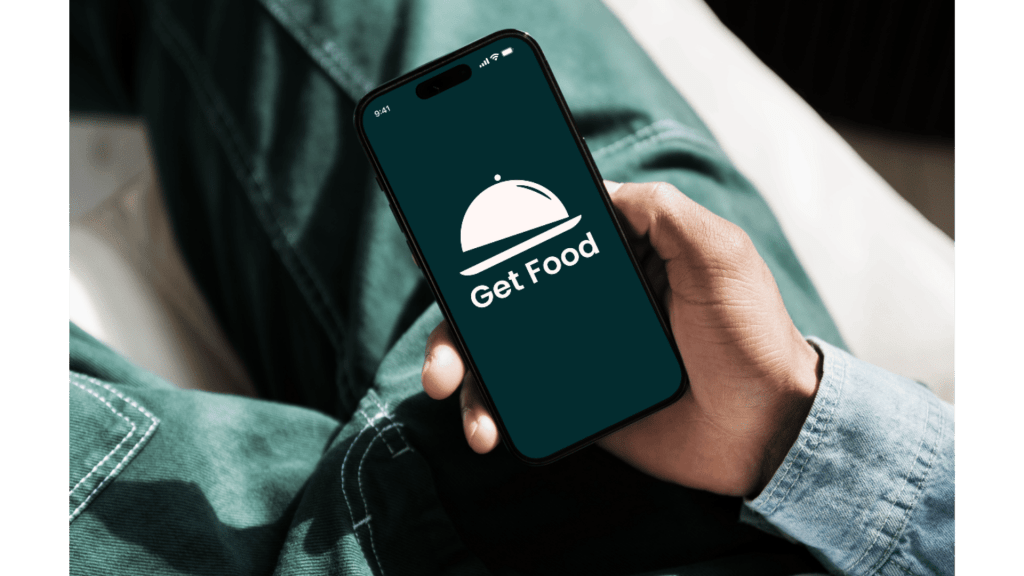
A high-speed, intuitive mobile solution designed to turn meal ordering from a chore into a seamless experience.
Role: UI/UX Designer
Tools: Figma, Miro, Competitive Benchmarking, User Personas
Duration: 4 Weeks
Focus: Speed Optimization, Payment Security, User Trust
Overview
GetFood is a mobile food delivery application designed to help users discover restaurants and various cuisines effortlessly. The project focuses on a “speed-first” philosophy, offering a simple order flow, real-time tracking, and a secure payment experience. By providing features like favorite restaurants, coupons, and order history, GetFood aims to make the dining experience transparent and efficient.
The platform is built to:
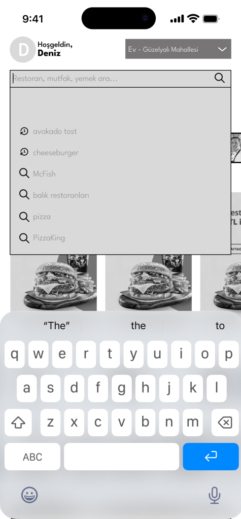
- ⚡ Enable fast discovery through intuitive navigation and visual menus.
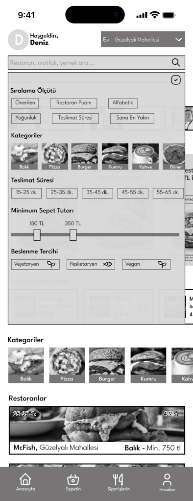
- 🎯 Give users control with advanced filtering and sorting options.
- 🛡️ Minimize effort during address selection and payment stages.
Target Audience & Persona
Deniz Akman (27, Graduate Student & Freelancer)
Deniz represents the “Busy Professional” identified in the brief—someone who frequently orders food at home or in the office.
- Persona Traits: According to his profile, Deniz is highly independent, tech-adapted, and deeply values security.
- The Conflict: He is very busy and slightly disorganized, meaning he needs an app that helps him decide and order with “minimum effort” so he can return to his work.
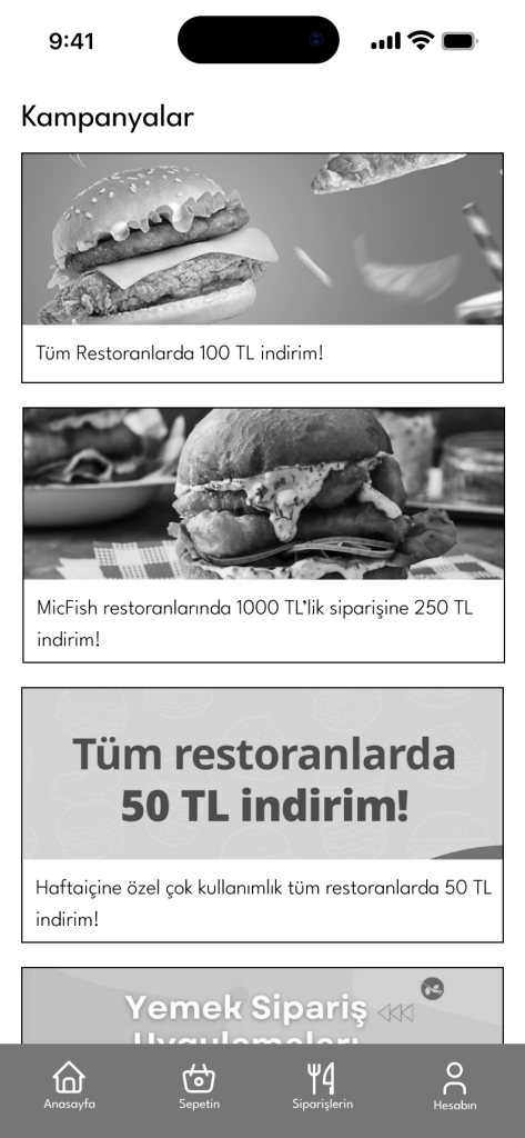
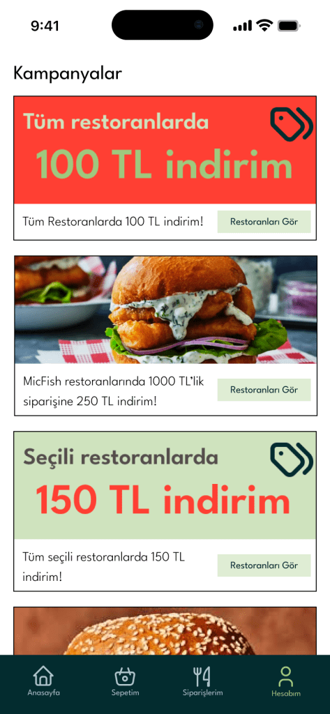
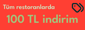
- Key Motivation: Finding different cuisines quickly while utilizing campaigns and coupons to manage his budget.
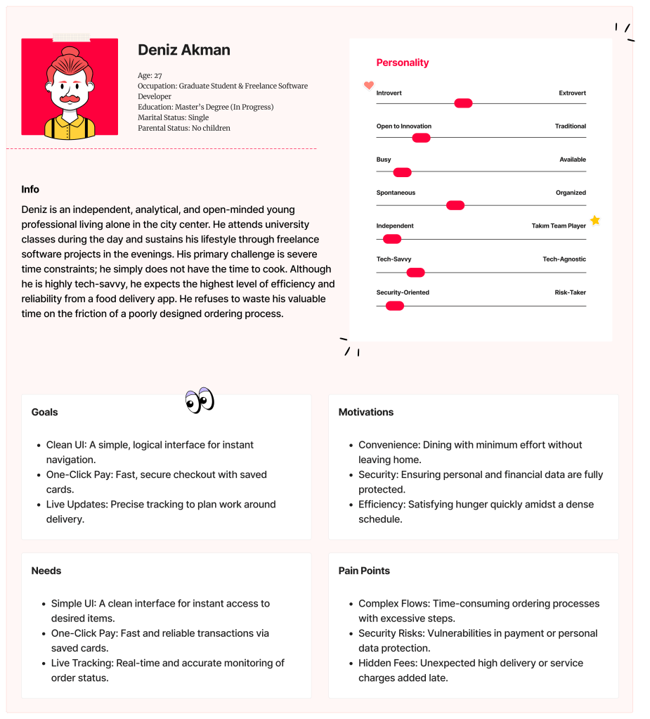
Project Goals
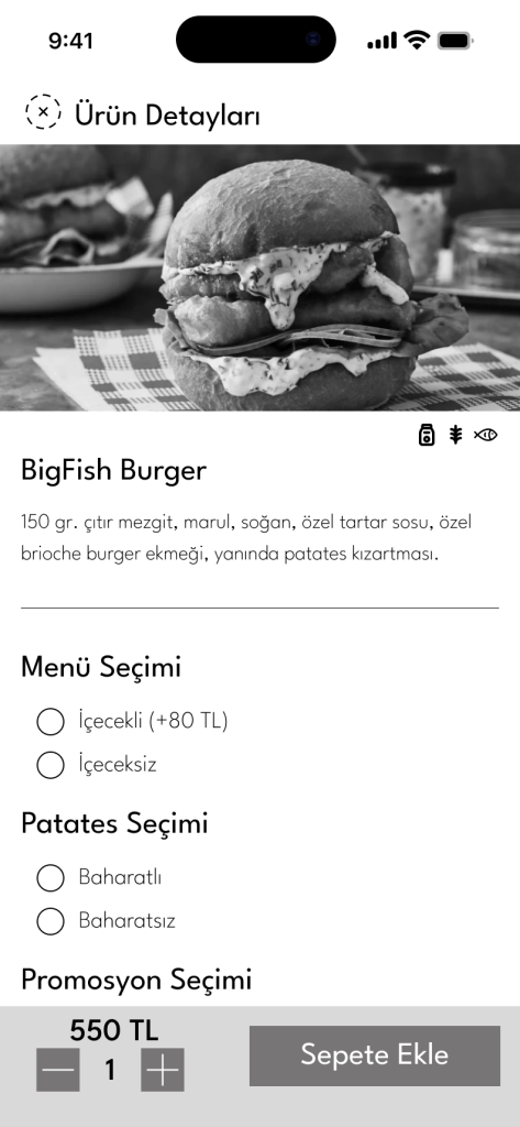
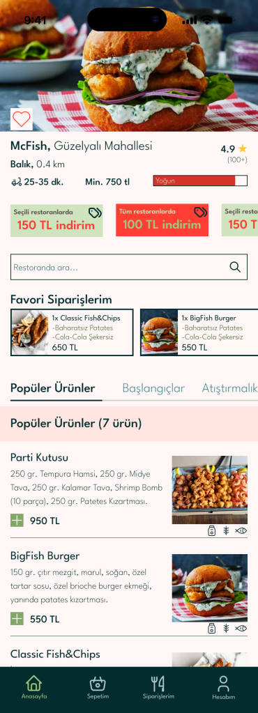
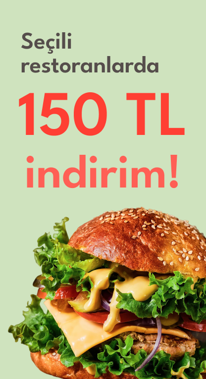
- Visual Clarity: Presenting menu and product details in a clear, visually weighted, and understandable way.
- User Control: Empowering the user with sorting options by restaurant, cuisine, or price range.
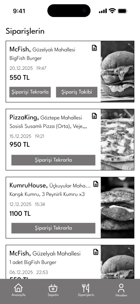
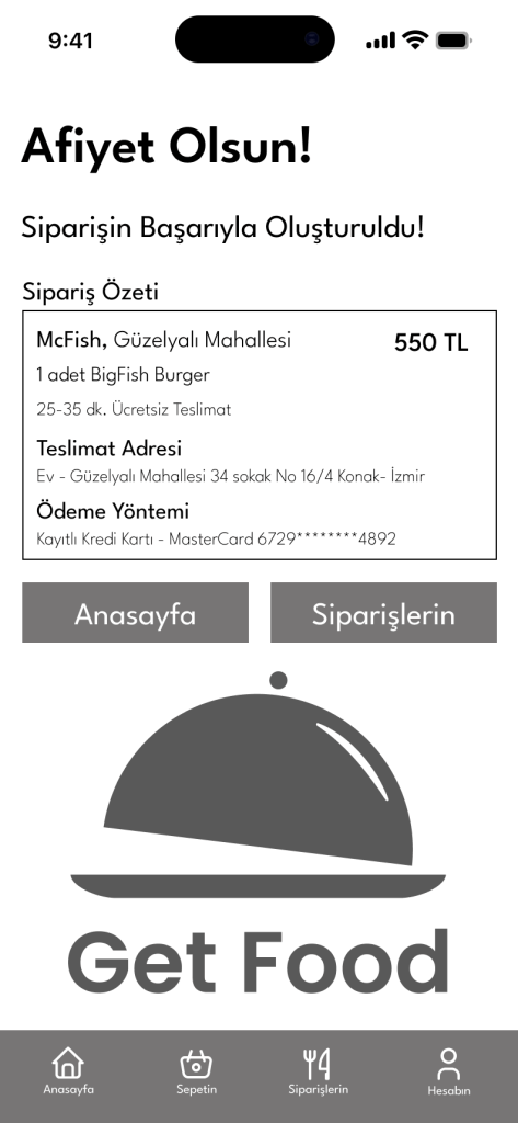
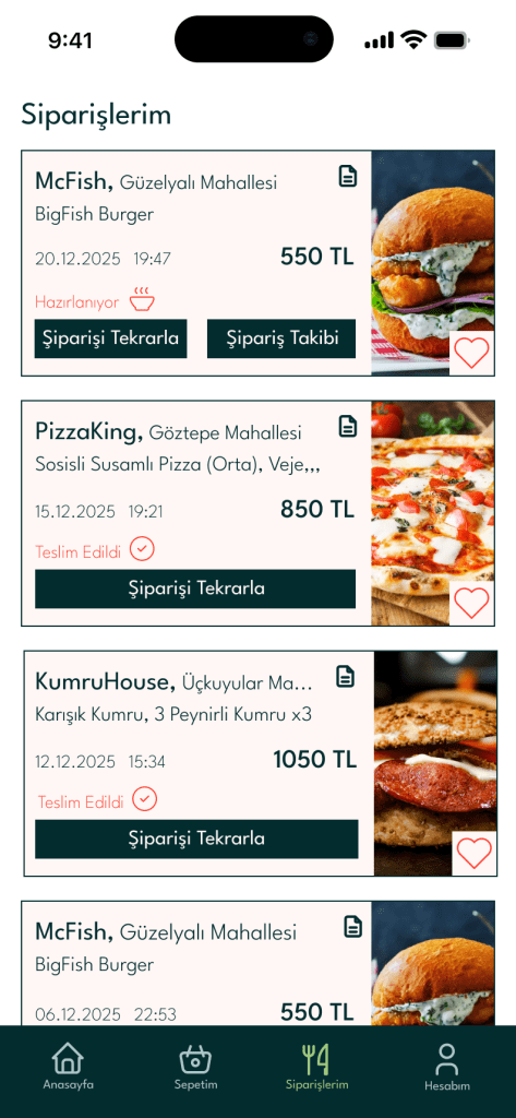
- Transparency: Providing a transparent end-to-end tracking system and easy access to order history.
The UX Process: Bridging Brief to Design
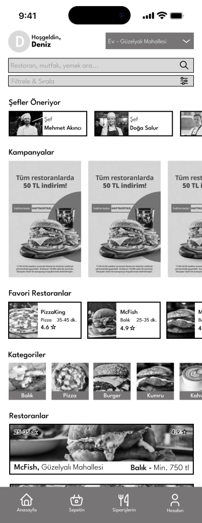
1. Wireframes: Strategic Architecture
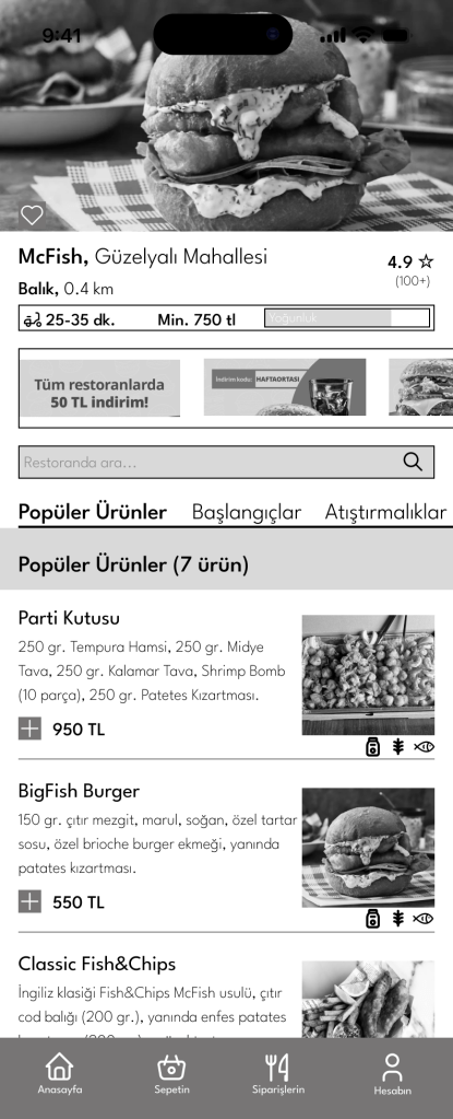
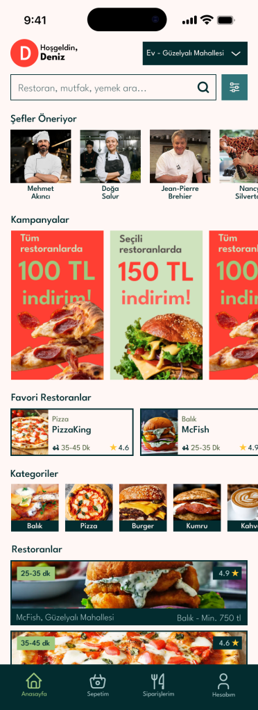
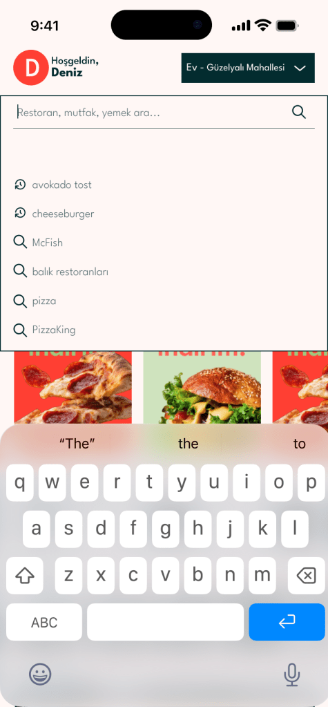
- Fast Discovery: The landing page prioritized the search and favorite restaurant features mentioned in the brief.
- Scannable Menus: Layouts were designed to be “visually weighted” to help users like Deniz make quick decisions.
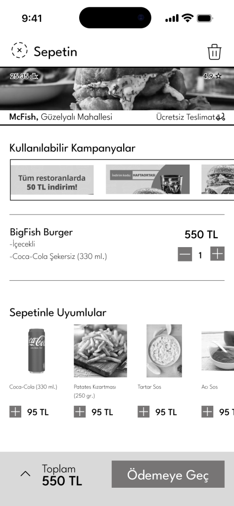
2. User Flow: The Minimum Effort Path
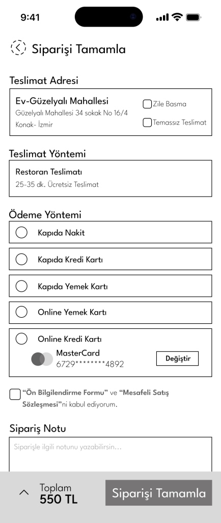
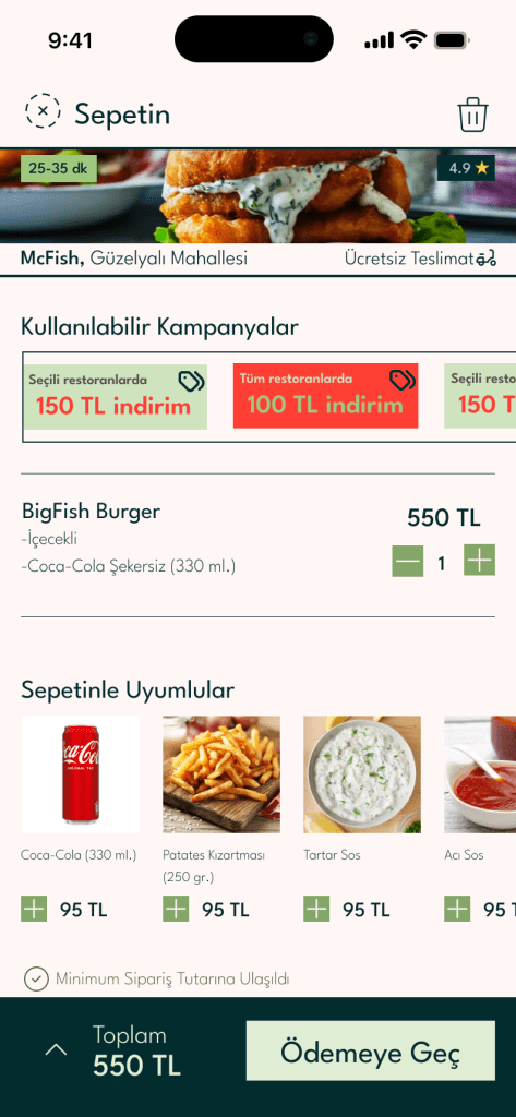
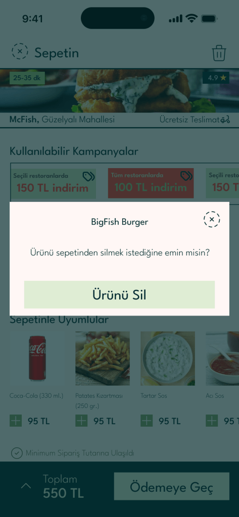
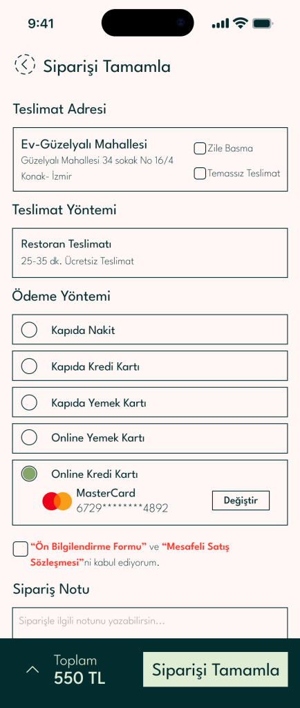
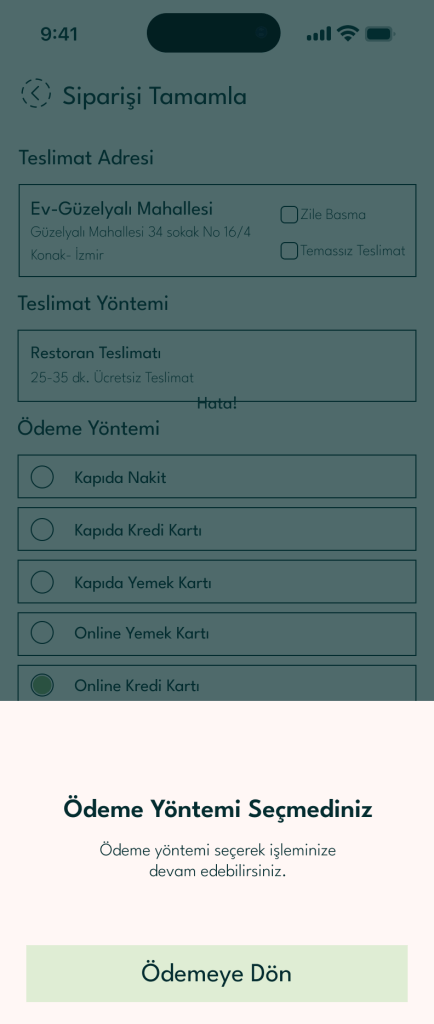
Following the brief’s goal of completing steps with “minimum effort,” my user flow eliminates unnecessary clicks. I focused on the transition from Discovery – Cart – Secure Payment to ensure a friction-free journey.
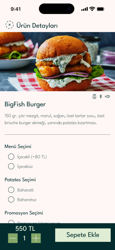
3. Key UI Pages & Elements
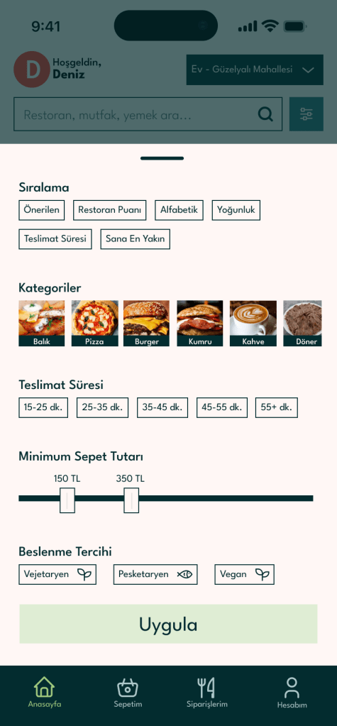
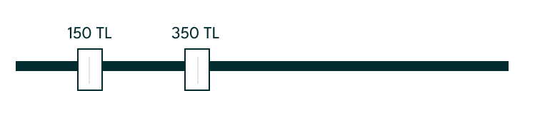
- Filtering System: Designed a robust filter for price range, cuisine, and rating, giving Deniz the “feeling of control” he needs.
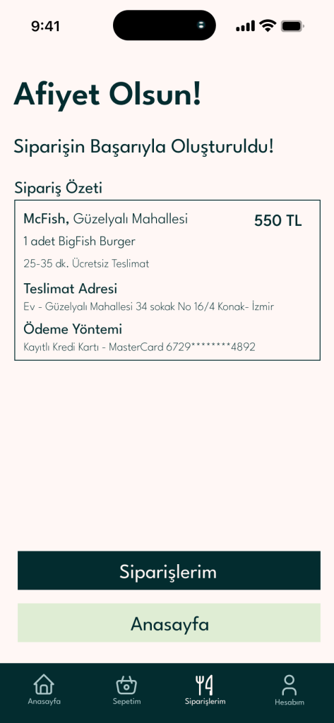
- Real-Time Tracking Screen: A transparent interface that follows the order from the kitchen to the doorstep.
- Secure Checkout: Integrated “Saved Cards” and “Coupon Management” to satisfy the security-conscious and campaign-focused user.

Reflection
This project highlighted the importance of “Minimum Effort UX.” By strictly following the brief’s requirement for intuitive discovery and clear visual menus, I learned that a successful app isn’t just about features; it’s about how quickly those features solve a user’s problem.
